A recent public hearing for NCDOT’s I-440 project, which leverages PublicInput.com — Photo Credit Ethan Hyman of the News & Observer
We hear the question almost weekly from clients doing public outreach on on planning initiatives and public projects:
“How do I know when I’ve heard from enough people?”
For many years, the answer to that question has been “it depends”. How many people came to the meetings? What do you know about your area’s residents? Do you feel like you heard from more than the usual suspects?
This month, we’re launching a breakthrough way to quantify public engagement success
It’s a project launched on PublicInput.com as part of a partnership with Reach NC Voices, a statewide public engagement campaign by Blue Cross and EducationNC.
Reach NC is engaging urban and rural communities across the state, and wanted to be confident they were hearing from a comprehensive set of voices in each community they touched.
Demographic data on specific communities is readily available from the US Census Bureau, but that data is difficult to use in the context of community engagement. How do I connect it to my data? And what if my community spans multiple census blocks?
The solution came in the form of deep integration of census data sets into PublicInput’s respondent database. We connected every aspect of participant data to the relevant components in the census data, tying a user’s location, age, race, gender and more to the relevant census data.
The end result is a tool that gives you a clear picture of who’s participating, and more importantly, who’s missing.
Here’s a quick overview of how it works:

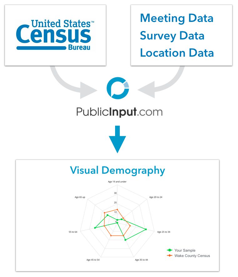
The data you collect through PublicInput.com is contrasted with the known demography of your community to provide an interactive look at what groups are over-represented or missing altogether.
The data you collect through PublicInput.com is contrasted with the known demography of your community to provide an interactive look at what groups are over-represented or missing altogether.
See it in action
Automatic recommendations for how to improve
You may have noticed that in addition to offering you a visual look at your demography, it scores the quality of your sample and provides recommendations for improving it.
In the case of the example above, the sample data is pretty good. Here’s an example of one that needs improvement:

Looks like bachelors degree holders were a bit over-represented!
Using these tools, you instantly know where your engagement efforts stand, and if there’s any groups you’re missing.
But what to do about the people we missed?
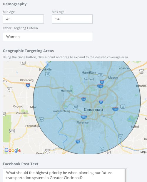
With PublicInput.com, this age-old engagement problem is not an obstacle, but rather the path to success. You have integrated social media targeting to help you engage under-represented populations:

Targeted social advertising interface for a client (OKI) in Cincinnati
Leveraging this “listen -> assess -> listen again” approach, you can understand more clearly what public engagement success means for your community. And since you can iterate quickly and report in real-time, you can achieve this success with a fraction of the time and resources typical of the public involvement process.
Meet Visual Demography’s Creator
This powerful new tool is the brainchild of PublicInput’s lead data scientist, Bryan Noreen. He joined the team this spring to help with the Reach NC Voices project, and has been contributing to the platform’s technical capabilities ever since.

Bryan Noreen — The brain behind Visual Demography
Bryan is well-equipped to design complex analysis and data visualization tools. A graduate of UNC-Chapel Hill, he majored in Mathematics and minored in computer science. Then, as if that wasn’t enough, he completed his Masters in Business Analytics at the University of Tennessee, where he graduated with honors.
While there, Bryan received a prestigious award from Booz Allen Hamilton for none other than… creating totally amazing data visualization tools.
This is starting to look like a trend.
If you’re on the development team for PublicInput.com, you know that this trend from Bryan is definitely going to continue.
Buried one layer behind demographic visualization and sample scoring is a suite of tools that we’re building with Reach NC that will transform the way people collect and assess public opinion. That’s about all we can share for now — stay tuned because the best is yet to come.
Schedule a demo to learn more about community engagement software:
[gravityform id=”3″ title=”true” description=”true”]


