Equity Mapping Layers and Data Explained for Community Engagement Initiatives

How Equity Data Integrations Transforms Community Engagement Into Action
PublicInput’s Equity Mapping tool integrates data from multiple sources to help you place engagement data into context. But where does this data come from?
Learn more about how we use ArcGIS to incorporate powerful screening tools created by the EPA, Justice40 Initiative, and the Census Bureau to help you translate engagement data into community action.
Environmental Justice Data
Environmental justice is integral to the ongoing health and sustainability of our communities. Everyone deserves access to the same levels of protection from environmental and health hazards, regardless of their race, color, nationality, or income.
Environmental hazards can negatively impact communities for decades. For example, the effects of lead poisoning are permanent; the ensuing health conditions and developmental delays can change the health and wellness of a community for generations. We cannot go back in time and undo past transgressions, but we can ensure we consider environmental justice by offering EJ communities a voice in future decision-making.
EJScreen
EJScreen was created by the Environmental Protection Agency (EPA). It’s a mapping and screening tool that combines environmental, demographic, and socioeconomic factors. The goal is to help agencies understand environmental and health-related issues in their communities and make progress towards environmental justice for all.
The EJScreen tool includes 12 environmental indicators, 7 socioeconomic indicators, 12 EJ indexes, and 12 supplemental indexes. These indicators, when combined, help to identify areas that could be experiencing environmental injustice.
The guiding principle of environmental justice is that everyone, regardless of race, color, national origin, or income is entitled to equal protection from environmental harms and risks.

Above Image Caption:
EJScreen uses government data to identify communities that are at a higher risk of being impacted by environmental harms and risks. The above map details the average change in drought over a five-year Standardized Precipitation Evapotranspiration Index (SPEI) as compared to historical data collected from the years 1900 to 2020.
Justice40 Initiative
Executive Order 14008 was signed into law by President Biden in 2021, establishing the Justice40 Initiative: a national commitment to environmental justice. Both new and existing programs that make covered investments into its seven categories are considered Justice40 covered programs. Justice40 covered programs are required to conduct meaningful engagement with stakeholders.
As part of this, the White House created the Climate and Economic Justice Screen Tool, or CEJST– a geospatial mapping tool that identifies disadvantaged communities that might be marginalized or overburdened by pollution and underinvestment.
The tool uses datasets as indicators of burdens. The burdens are organized into categories. A community is highlighted as disadvantaged on the CEJST map if it is in a census tract that is (1) at or above the threshold for one or more environmental, climate, or other burdens, and (2) at or above the threshold for an associated socioeconomic burden.

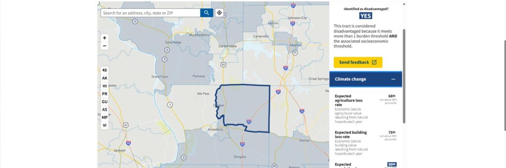
Above Image Caption:
CEJST uses census tracts to identify disadvantaged communities. Selecting a specific location will give you a break down of why a community has been identified as disadvantaged, as well as how the community compares to national thresholds.
What’s the difference between EJScreen and CEJST?
EJScreen provides a nationally-consistent dataset and approach to combining demographic and environmental indicators.
CEJST was developed specifically to provide a uniform definition of disadvantaged communities for Federal agencies. CEJST’s methodology was developed to help allocate resources to support Justice40 programs.
EJScreen and CEJST complement each other – the former provides a tool to screen for potential disproportionality at the community level, while the latter defines and maps disadvantaged communities for the purpose of informing how Federal agencies guide the benefits of certain programs, such as the Justice40 Initiative.
Qualified Census Tracts
Dictated by the Department of Housing and Urban Development (HUD), Qualified Census Tracts (QCTs) are any census tract or equivalent geographic area in which at least 50% of households have an income less than 60% of the Area Median Gross Income.
QCTs are prepared using data from the United States Census Bureau, and are updated yearly to reflect the newest changes to low-income housing funds and legislation. HUD and the U.S. Treasury use this data to define underserved and disproportionately impacted communities. Adding this layer to Equity Mapping, in addition to EJScreen and Justice40 layers, helps to place into context how different demographics can or would be affected by a project.

Above Image Caption:
2023 Qualified Census Tracts (QCTs) and Difficult Development Areas (DDAs) use census data and act as a foundational framework for other mapping tools, such as the CEJST.
Personal Map Layers
Defined and customized for our customers during PublicInput product onboarding, personalized map layers can serve many different functions. Customers using PublicInput’s Equity Mapping tool have personalized maps to include…
- Geographic boundaries for a project, county, town, etc.
- Existing transportation routes
- Parks and recreation facilities
- School districts
These custom map layers can be useful when planning, executing, or reviewing engagement projects.

Above Image Caption:
Using custom map layers, such as park boundaries, roads, and trails, can help add extra context and perspective in the Equity Mapping tool.
Participation Data Layers
All of these data layers mentioned above are informative, but can’t reach their true potential for community engagement without the final puzzle piece: engagement data.
With Equity Mapping enabled, every project or meeting you conduct within the PublicInput platform will result in a new data layer. These are arranged in alphabetical order on your dashboard, and can be toggled on or off, just like the other layers. Our system uses general geographical location data to put your participants on the map, allowing you to compare and contrast your participation data with EJScreen, Justice40, and QCT data.
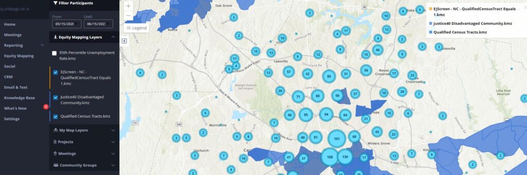
Above Image Caption:
Overlapping Justice40, EJScreen, and QCT layers with project data can help you gain valuable insight into who’s participating, why, and which communities need additional support and outreach.
ArcGIS
All of PublicInput’s mapping features are made possible by integration with ArcGIS. ArcGIS is a client, server, and online geographic information system (GIS) managed by Esri. ArcGIS offers location-based analytical capabilities; the goal is to use geospatial mapping to analyze and contextualize data.
ArcGIS uses GIS to build maps in which every category of data exists in its own separate layer. You can then toggle and overlay these layers over your map to see how data intersects. PublicInput uses ArcGIS within our Equity Mapping feature. The map is built on top of a client’s location. The EJScreen, Justice40, and QCT layers are pre-built into the system; any additional layers are added in via customization and coordination with our Product and CSM team.
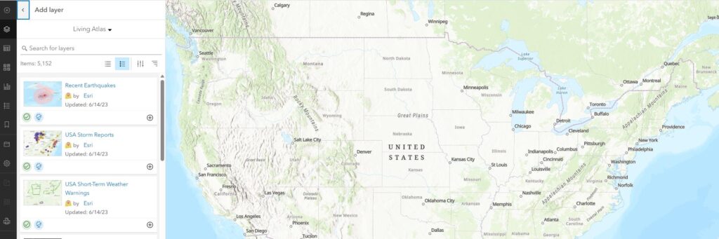
Above Image Caption: ArcGIS is one of the most widely used data mapping tools in the world.